My purpose is to inform the audience about contact and access information, white water rafting courses and it's prices.
Also, my goal is to make the audiences feel that we provide sincere service, and make them consider using it.
My audience would be youth group leaders, so they will be looking for safety, chances for teamwork, and opportunities for fun.
The first thing the site should do is ensure safety, and fun.
Youth groups could be for church, recreation for after school activity teams, or for school trips.
The key things to consider here is that it is the adults who are going to visit the site, so it should be a clean-cut site where the important information is clearly noticeable.
The prices should be affordable for the groups, and should have a group discount.
There should be courses for beginners and intermediate, but not for high level rafting because safety first, and it is just for fun.
The color should appeal the fun part of the rafting, but also the calmness that reinforces safety and have an at-home warmth, so I should be carefl not to be too aggressive with the colors that trigger excitement.
The typography shouldn't be fancy because the main focus is the information. The audience is probably busy, so I want them to be able to cut to the chase and read the information clearly.
Also, it isn't royal water rafting so fancy typography may come off as too elegeant for such an active outdoor sport.
Overall, simple, informative and not too aggessive are the points. Pictures would be crucial for this site, and because it is marketed towards groups, group photos would be best.
Palette URL: https://coolors.co/396e94-e7c24f-a43312-381d2a-aabd8c
| Primary | Secondary | Accent 1 | Accent 2 |
|---|---|---|---|
| [#FFBE33] | [#3EB68A] | [#36558F |
It's simple and noticeable. The width of the letters are wide, especially when they are capitalized.
This font is stylish and round, in contrast to the heading font which is a bit choppy. It also gives a softer nuance to the site, to reinforce the safety of the site's activties.
The best Whitewater Rafting in Colorado, White Water Rafting Company offers rafting on the Colorado and Roaring Fork Rivers in Glenwood Springs. Since 1974, we have been family owned and operated, rafting the Shoshone section of Glenwood Canyon and beyond.
Trips vary from mild and great for families, to trips exclusively for physically fit and experienced rafters. No matter what type of river adventures you are seeking, White Water Rafting Company can make it happen for you.
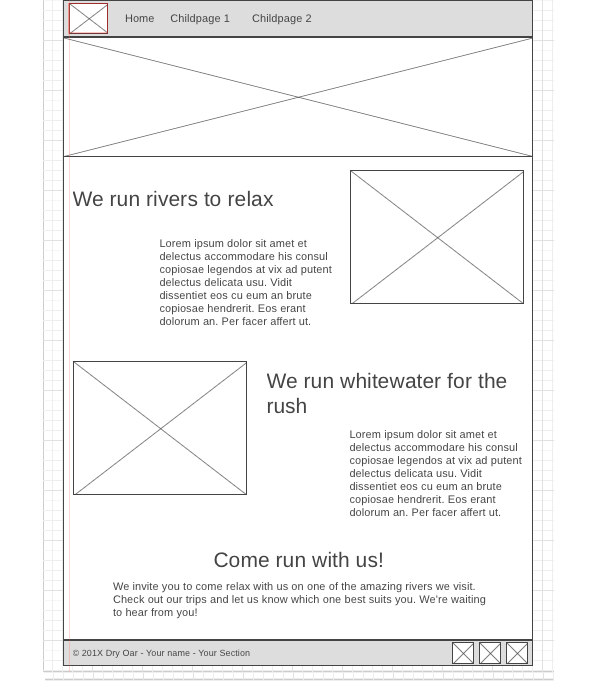
The Site Map of a site is just like it sounds…it is a map of the pages in a site and how they are related and linked together. From the map above we can see that we will eventually have the Home page and 2 sub or child pages.
The lines that connect them all together indicate that each page should be accessible from any other page, it is essentially showing us the global navigation for the site.
Wireframes are like blueprints for making webpages. They should show the major sections of content that will be on the page and the relative locations of each element. In the wireframe below you can see there will be 6 sections to our page: